

Table of contents
Just for you
No items found.
Merge has rebranded! Here’s what the future of product integrations looks like


Lanna Wang
Our mission at Merge is to make secure data access easy.
This mission is reflected in everything we work on—and our brand is no exception.
You can read on to learn why our mission inspired us to rethink, redesign, and relaunch our new brand!
Why we rebranded
We felt like all the improvements made to our product over the past few years warranted a brand refresh that better fits our enterprise-grade platform.
We also wanted our new look and feel to better encapsulate several elements that are core to our platform:
- Speed: Merge makes it easy to add customer-facing integrations at scale
- Accessibility: Merge allows customer-facing teams to manage integrations independently and effectively through our Integration Observability features
- Power: Merge’s integrations are incredibly reliable, flexible, and scalable. You can access and sync all the customer data you need across our 220+ integrations
Taking these elements together, we performed extensive research and ultimately landed on a new logo, typefaces, color palettes, illustrations, and brand voice that we love and think you will too!
Meet the new Merge
Here’s a look at the new Merge:
Color palettes
We’ve completely revamped our primary colors to tones that add depth and complement each other perfectly.
The bright orange is a personal favorite of mine. We’ll only use it sparingly but it adds an extra emphasis that makes our brand’s look and feel stand out.

We’re also adding an entirely new secondary palette. We’ll use these colors to a lesser extent, but when we do, we think they’ll add a visual hierarchy that accentuates our primary colors.

Logo
Our new logo is a single color: charcoal. This provides an additional level of elegance and simplifies our aesthetic.
We refined the curvature of our logo mark and used a bolder typeface to make our logo feel more visually balanced.

Typefaces
Our primary typeface is now FH Oscar Pro.

It allows us to provide an extremely readable typeface and lets us maintain a bold and modern look and feel. You can expect to see it in our medium to large headlines.
Our secondary type face is Inter, another easily-readable font type that’s also highly versatile (it comes with multiple weights and styles). We’ll mostly use it for our body copy and for copy in buttons.

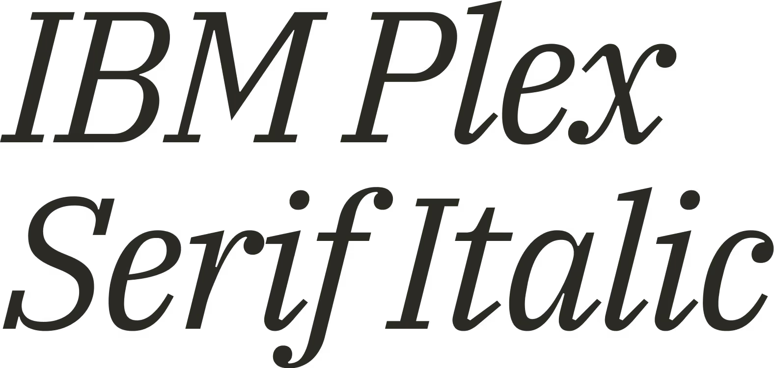
Finally, we’ll use IBM Plex Serif as our tertiary typeface. It provides a nice balance to the other font types and it allows us to draw attention to key areas (e.g., customer quotes).
Illustrations
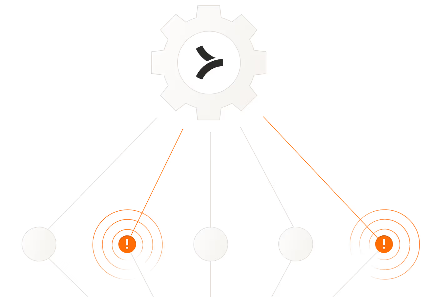
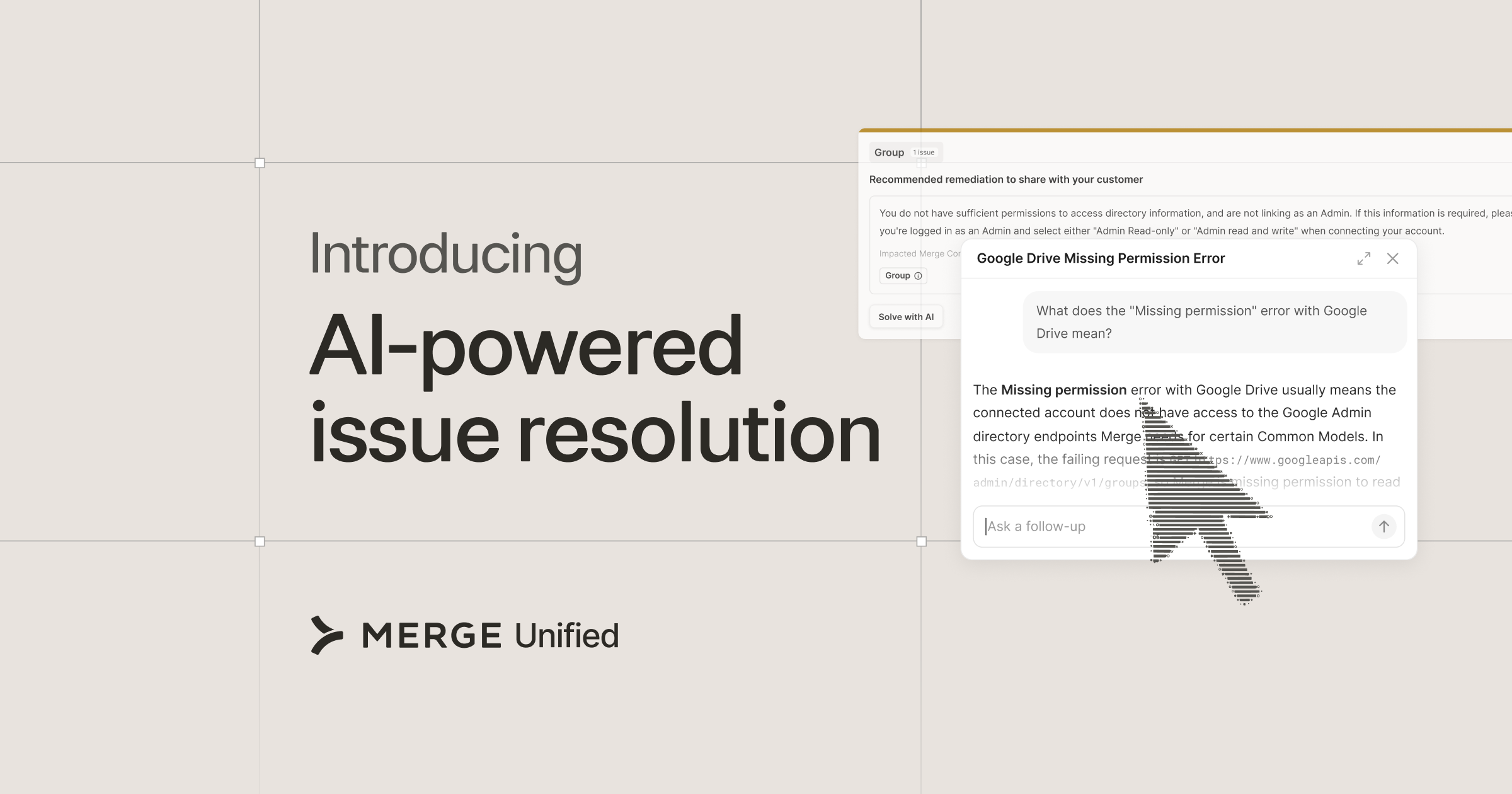
Our illustrations will communicate key concepts of our platform in a way that’s abstract—yet, elegant. For example, the image below can allude to the issue detection functionality that’s part of our Integration Observability feature set.
Brand voice
Our voice is rooted in 3 characteristics:
- Confident: Clear and conveying expertise
- Clever: Witty and evoking energy
- Committed: Empowering but not at the expense of being over-sentimental
We’ll apply these characteristics differently depending on the medium (e.g., a social post versus an article), but you can expect to read more engaging, clear, and energizing copy from Merge!
Putting it all together
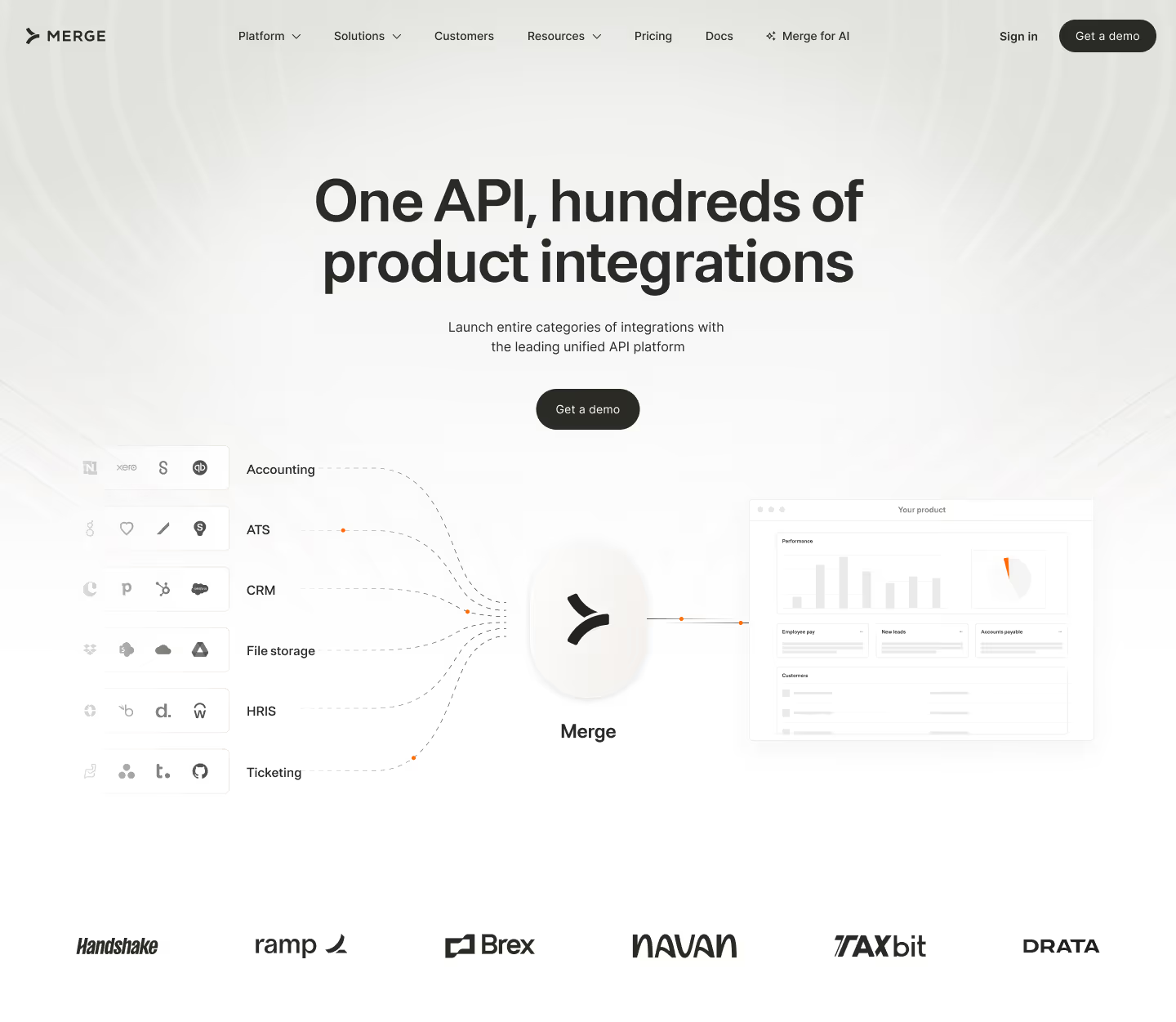
Here’s a peek at how this looks when you put everything together:
Final thoughts
Our new look and feel is an exciting milestone in Merge’s brand evolution.
It visually captures and conveys our mission of making secure data access easy across every integration we support for the thousands of companies we work with.
Ready to experience our rebrand? Check it out by visiting our homepage!
Lanna Wang
.png)
.png)


But Merge isn’t just a Unified
API product. Merge is an integration platform to also manage customer integrations. gradient text
But Merge isn’t just a Unified
API product. Merge is an integration platform to also manage customer integrations. gradient text
But Merge isn’t just a Unified
API product. Merge is an integration platform to also manage customer integrations. gradient text
But Merge isn’t just a Unified
API product. Merge is an integration platform to also manage customer integrations. gradient text